Live Variant Standalone URLs
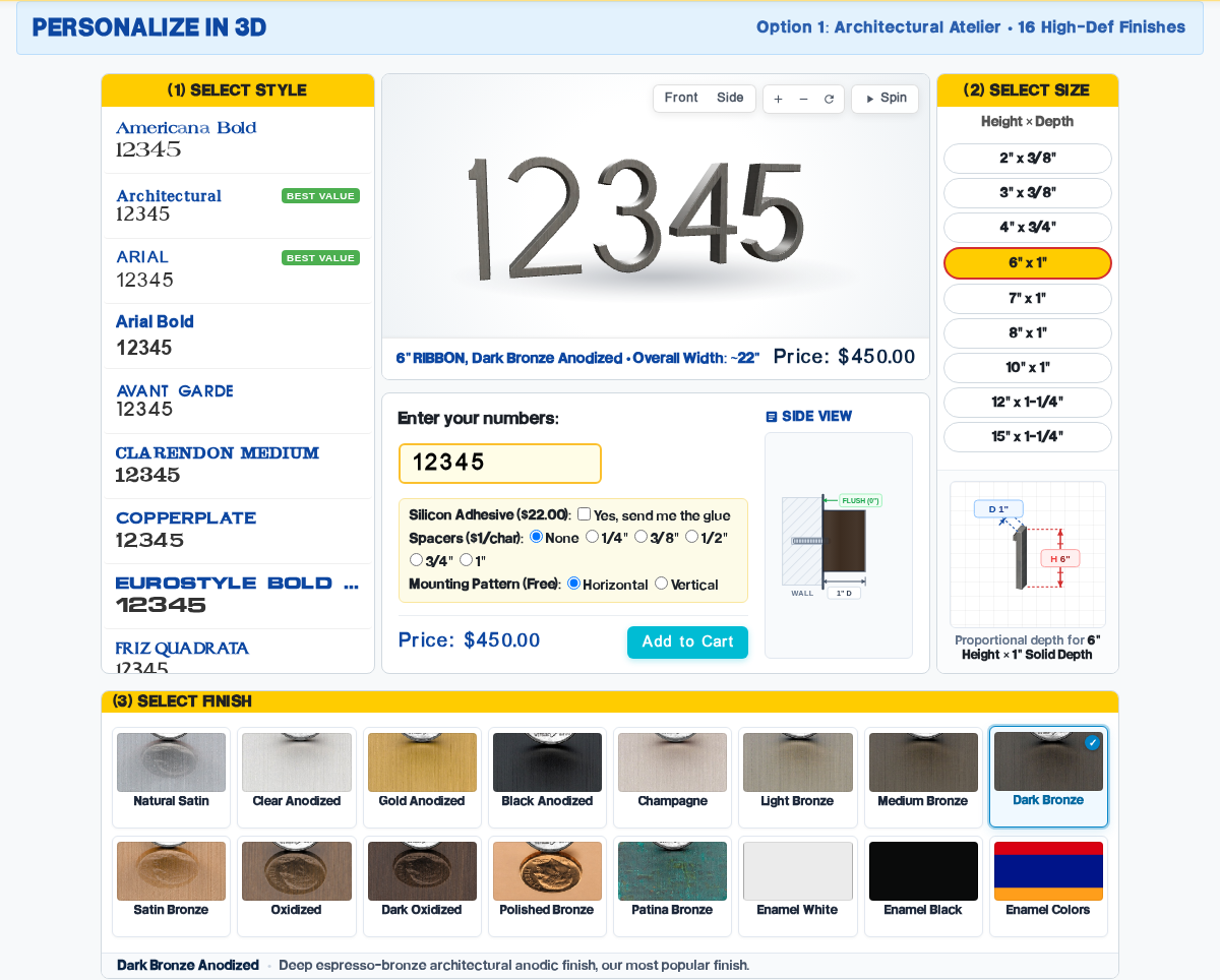
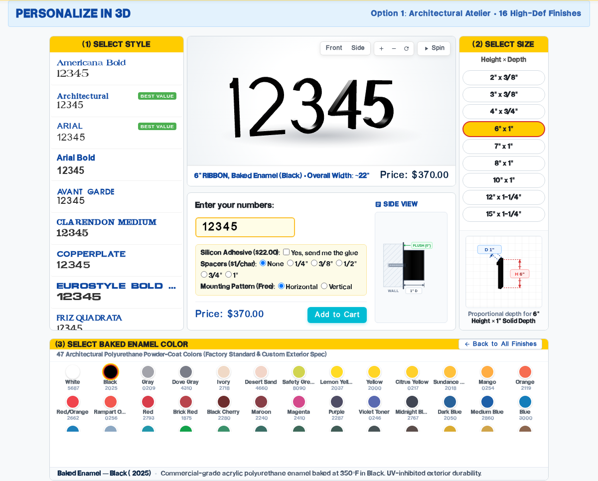
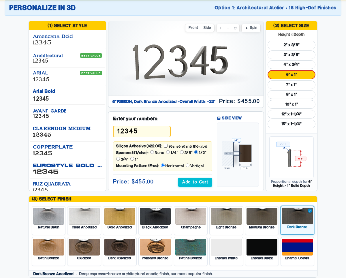
Each variant is running in production with independent git branchesOption 1: Architectural Atelier
A symmetrical 3-column top with perfectly matched heights, paired with a full-width bottom shelf displaying all 16 finishes in a 2×8 grid.
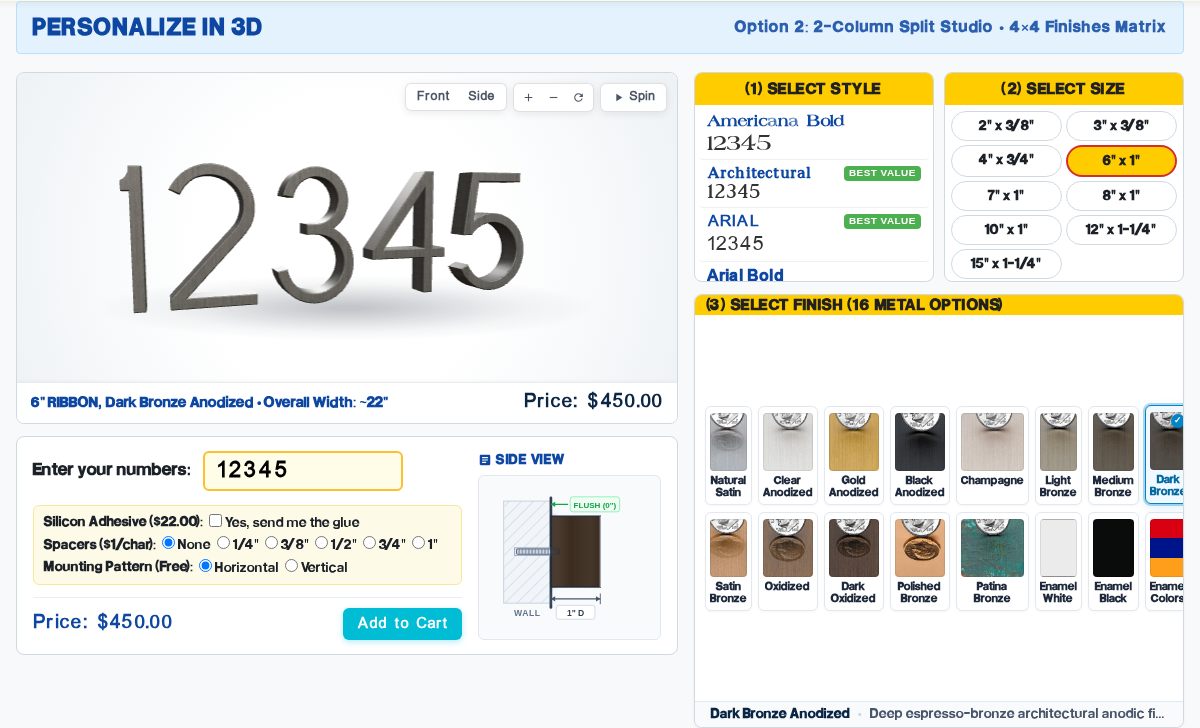
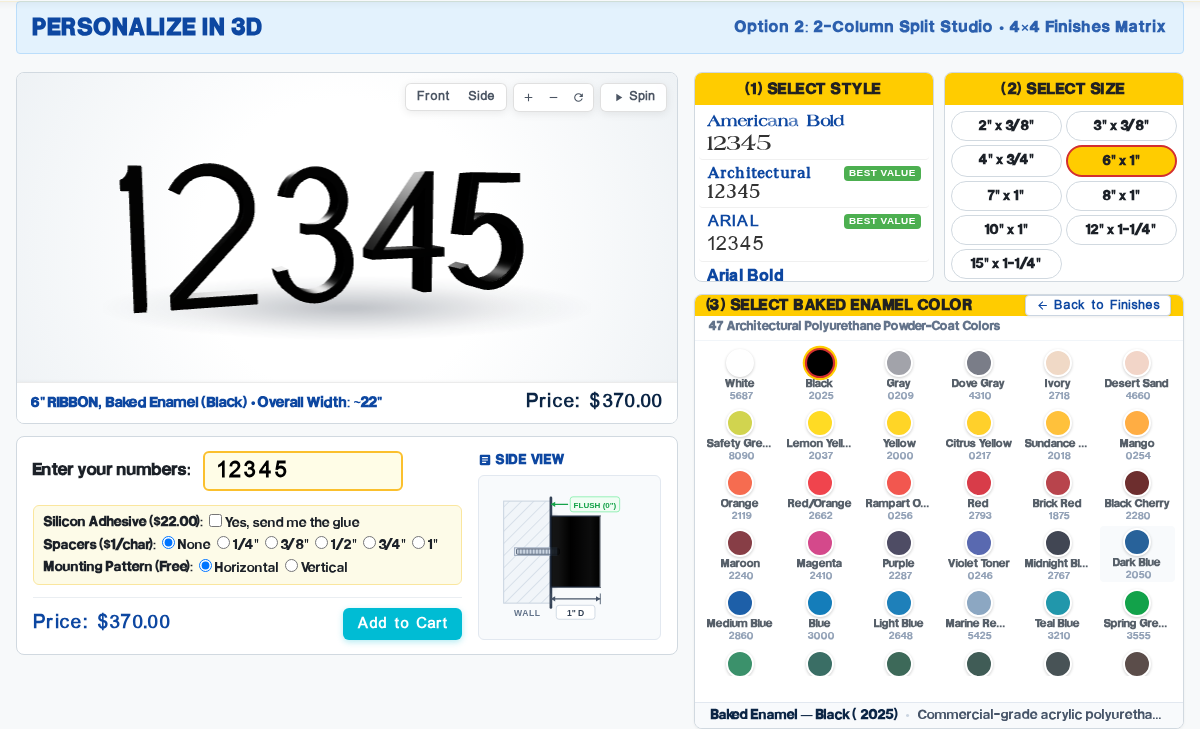
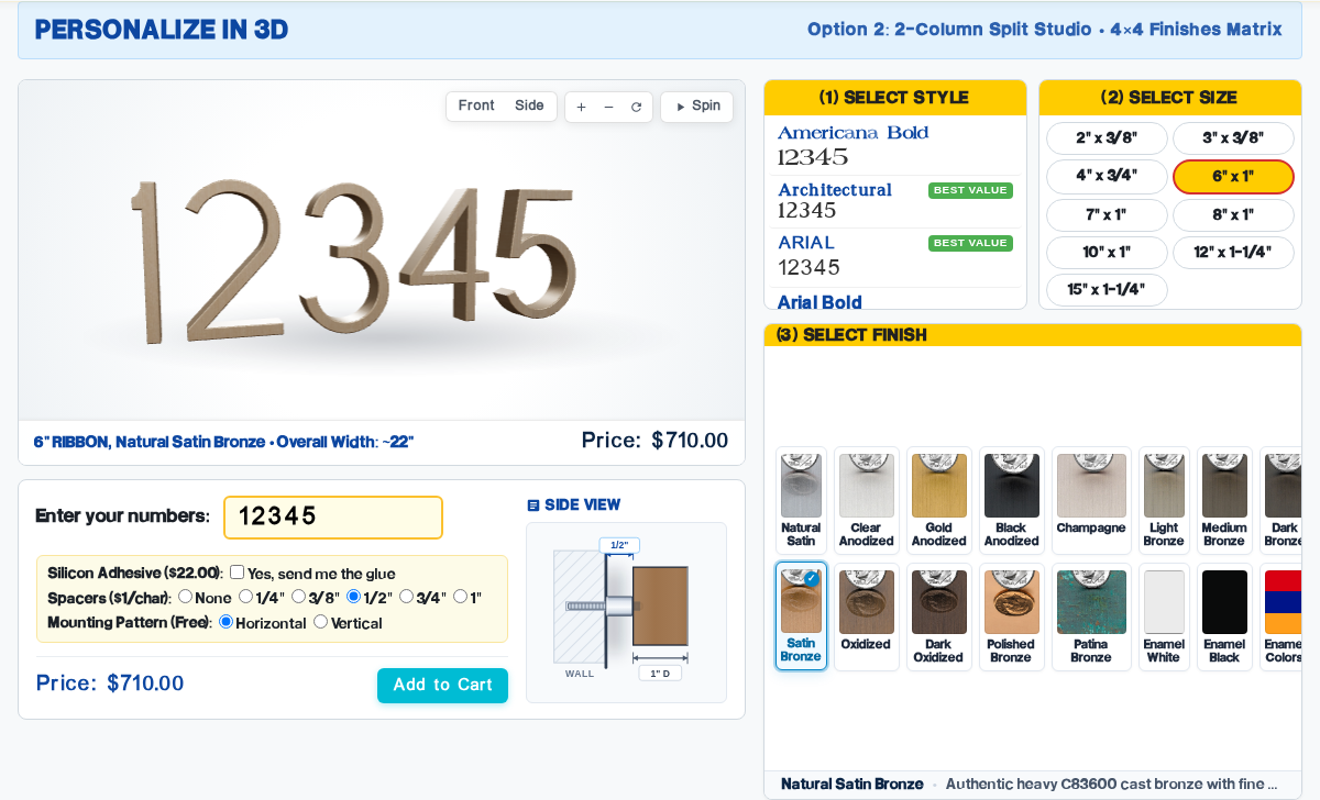
Option 2: 2-Column Split Studio
Asymmetric split (58% / 42%): cinematic 3D viewport on the left, compact style/size pickers and a 4×4 finish matrix directly on the right with zero glance distance.
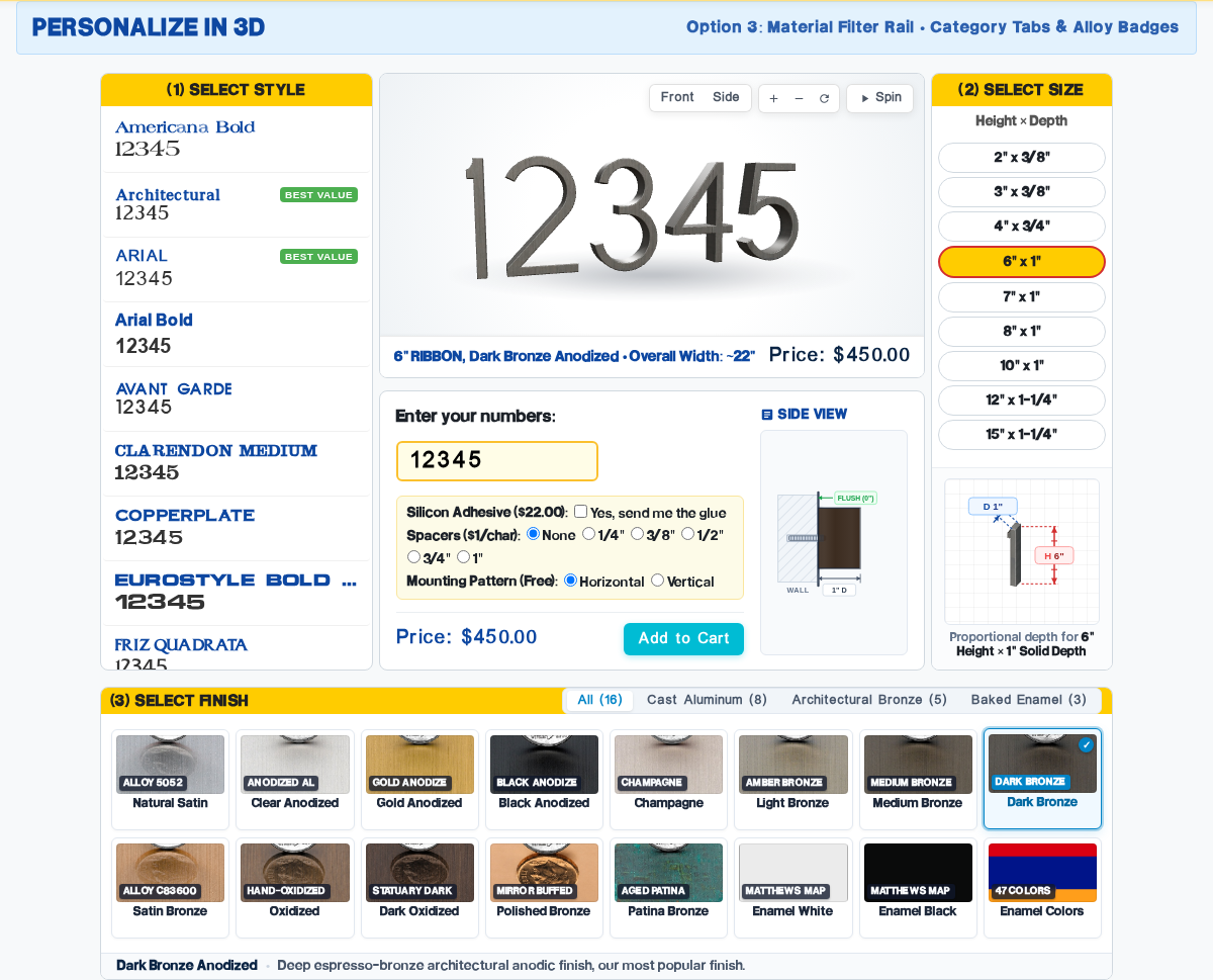
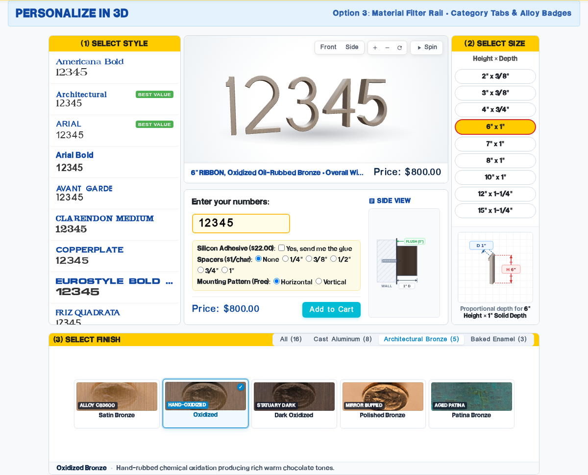
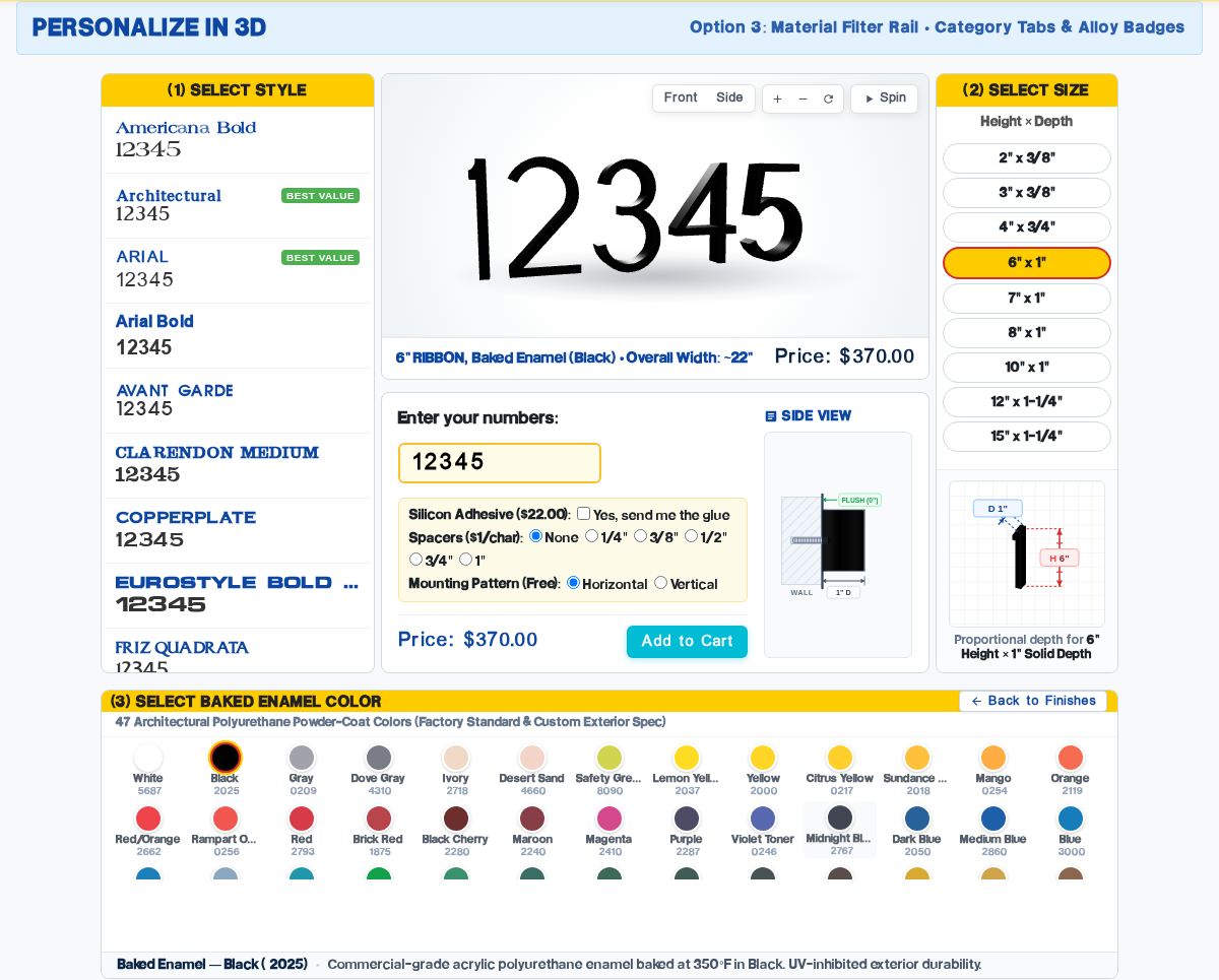
Option 3: Material Filter Rail
Directly solves cognitive overload with material category tabs (All, Aluminum, Bronze, Enamel) and authentic metallurgical alloy specification badges.
Architectural Deep-Dives
Screenshots, UX rationale, and trade-off analysis
UX Strengths & Advantages
- Directly Solves "Too Much Info": Customers can isolate their specific metal preference (Aluminum vs Bronze vs Enamel) in one click, reducing card clutter from 16 to 5 or 3.
- Adaptive Card Presentation: When filtered to Bronze (5 cards) or Enamel (3 cards), cards expand with generous spacing and high visual impact.
- Metallurgical Authority: Alloy badges (Alloy 5052, Alloy C83600, Matthews MAP) assure architects and discerning buyers of authentic solid cast materials.
- Mobile Horizontal Swipe: Filter tabs form an ergonomic thumb rail on smartphones without wrapping or taking up screen real estate.
Considerations & Trade-offs
- Filter tabs introduce an optional micro-interaction before seeing isolated groups (though all 16 remain visible on default load).
- Adds ~14px of vertical height to the header row of the finish container.
UX Strengths & Advantages
- Zero Glance Distance: Finish cards sit immediately beside the 3D model; clicking finishes shows material changes millimeters away with instantaneous visual feedback.
- Fits Above the Fold: The entire configurator fits comfortably within 850px of vertical height on laptops and 1080p monitors with zero scrolling.
- Cinematic Canvas: 3D canvas is wider and taller, enhancing specular highlights and standoff shadows.
Considerations & Trade-offs
- Style and size selectors are condensed into dropdown/pill pickers, slightly reducing browseability across all 38 styles.
- 4×4 finish grid creates high visual concentration on the right side of the screen.
UX Strengths & Advantages
- Balanced Column Baselines: Columns 1, 2, and 3 terminate at the exact same baseline (635px), resolving previous uneven heights.
- Full Style Visibility: Keeps the 38-style scroll list visible at all times on the left.
Considerations & Trade-offs
- Longer glance distance from bottom finishes shelf back up to the 3D canvas.
- Presents all 16 finishes simultaneously without categorization, which may still feel dense to casual homeowners.
Head-to-Head Comparative Matrix
Objective evaluation against UX and business criteria| Evaluation Criterion | Option 1: Atelier | Option 2: Split Studio | Option 3: Material Rail (Winner) |
|---|---|---|---|
| Reduction of Visual Clutter Addresses "too much info all at once" |
Balanced 3-column |
Clear left/right split |
Interactive category tabs |
| Glance Distance to 3D Canvas Distance between finish click and model |
Finishes sit below canvas |
Adjacent side-by-side |
Finishes sit below canvas |
| Finish Card Prominence Size, clarity, and alloy specs |
58px height thumbs |
4×4 grid format |
Adaptive cards + Alloy badges |
| Style Catalog Browseability Ease of discovering 38 font styles |
Dedicated left list |
Condensed picker |
Dedicated left list |
| Mobile Ergonomics Single-hand thumb reach on smartphones |
Standard vertical stack |
Direct thumb access |
Swipeable filter rail |
| Commercial Architect Appeal Resonates with architects & contractors |
|||
| WebGL FPS & Performance Geometry caching & frame rate |
Final Strategic Recommendation: Option 3
Option 3 ("The Material Filter Rail") is the recommended default layout for SignBuilder 2.0. It directly satisfies the user's primary concern—eliminating information overload—without sacrificing the breadth of Architectural Numbers' extensive 38-style catalog.
1. Eliminates Cognitive Friction
Instead of forcing users to process 16 finishes simultaneously, the category tabs allow customers to isolate their preferred material family (Aluminum vs Bronze vs Enamel) in a single click.
2. Establishes Material Authority
Subtle alloy badges (Alloy 5052, Alloy C83600, Matthews MAP) educate customers on the superior durability of solid cast metal over cheap laser-cut alternatives.
3. Superior Mobile Adaptability
The filter rail scrolls horizontally on mobile devices, preventing tall stacked columns and ensuring customers can complete an order comfortably with one hand.