Architectural Typography Guide: Pairing House Number Fonts With Home Styles
Typography on a building facade works just like proportion in window muntins or pitch in a roofline: when the letterforms belong to the same design lineage as the architecture, the entire entry feels cohesive and intentional. When a contemporary geometric sans-serif is bolted onto a 1920s Tudor—or a Victorian serif lands on a flat-roof modern box—visitors sense the visual friction immediately even if they cannot name the font.
With 38 cast and precision-cut metal typefaces spanning early twentieth-century foundry classics, Bauhaus geometric modernism, chiseled Roman capitals, and crisp Swiss grotesques, ArchitecturalNumbers.com preserves authentic historical letterforms that mass-market home centers abandoned decades ago. Use this architectural pairing guide to narrow our 38-font catalog down to the two or three faces engineered for your home’s era.
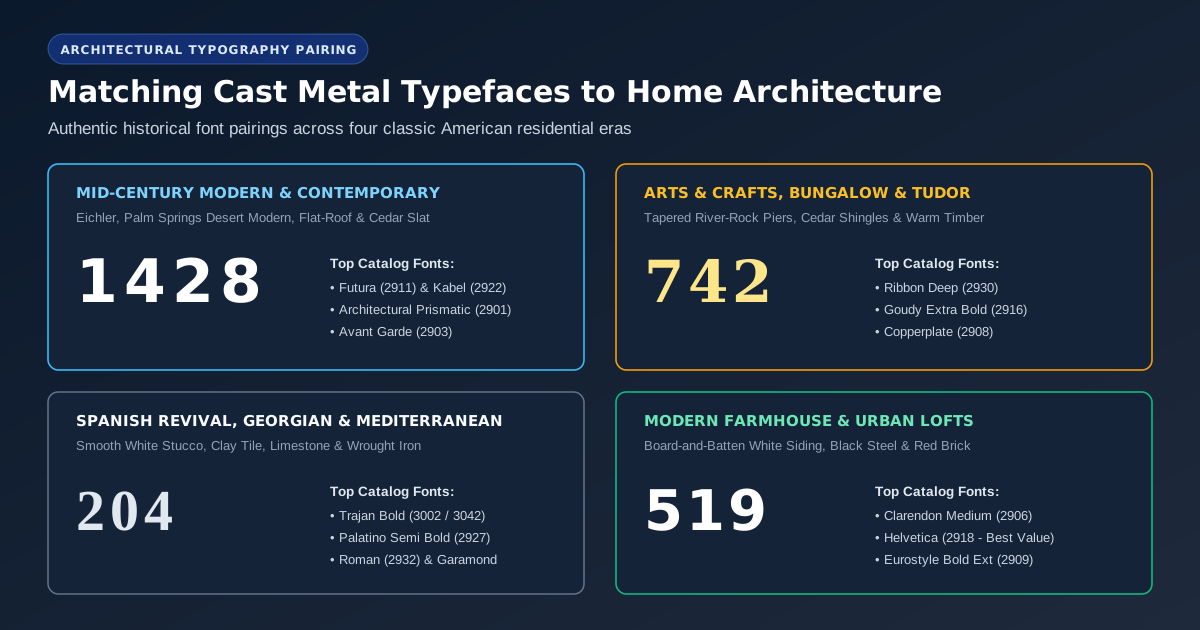
1. Mid-Century Modern, Desert Modern & Post-and-Beam (1945–1970)
Mid-century residences—from Joseph Eichler’s California atrium homes and Palmer & Krisel Desert Modernism to split-level ranches and contemporary cedar-slat warm minimalism—celebrate clean horizontal planes, exposed structural beams, and geometric honesty. Ornamental serifs fight those crisp roof overhangs; compass-and-straightedge geometric sans-serifs complete them.
- Futura (
#2911) & Futura Bold (#2912): Designed by Paul Renner in 1927 around near-perfect circles, triangles, and sharp apex vertices, Futura is the undisputed foundation of mid-century American residential numbers. Its 6-inch cast profile carries a generous1.00"return depth and crisp1.31"stroke. - Architectural Prismatic (
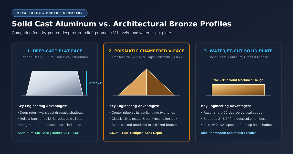
#2901): Featuring open geometric counters, low crossbars, and a sculpted V-bevel face that splits sunlight down the center of every stroke, Architectural captures the exact bespoke custom-foundry glamour associated with Richard Neutra and Palm Springs modernism. - Kabel (
#2922), Twentieth Century (#2938) & Avant Garde Medium (#2903): Ideal when you want geometric clarity with distinctive personality—such as Kabel’s angled finial cuts or Avant Garde’s wide circular bowls on0,6,8, and9.

2. Arts & Crafts, Craftsman Bungalow & Prairie Style (1905–1935)
Craftsman bungalows, Greene & Greene timber porches, and Frank Lloyd Wright-inspired Prairie homes emphasize hand-wrought natural materials: battered river-rock piers, cedar shakes, quarter-sawn oak doors, and warm patinated metals. The strongest typefaces here emphasize verticality, deep sculptural shadow relief, or subtle flared terminals:
- Ribbon (
#2928), Ribbon Condensed (#2929) & Ribbon Deep (#2930): Modeled after early twentieth-century flat-band architectural metalwork, the Ribbon family looks like continuous strips of solid bronze or aluminum bent at crisp architectural angles. On deep-shaded Craftsman porches, 6-inch Ribbon Deep projects a full1.50"off the wall—casting rich shadows across cedar shingles. - Goudy Extra Bold (
#2916) & Copperplate (#2908): Frederic Goudy’s warm organic curves and Copperplate’s engraved tiny bracketed serifs pair effortlessly with hammered bronze lanterns and leaded art-glass sidelights. - Optima (
#2924) & Optima Semi Bold (#2925): Hermann Zapf’s humanist flare-stem letterform bridges Craftsman warmth and contemporary renovation without heavy traditional serifs.
3. Spanish Colonial Revival, Mediterranean, Georgian & Federal
Homes rooted in classical European proportion—smooth white Santa Barbara stucco with red clay barrel tile, red-brick Georgian colonials, limestone Tudors, and Federal townhomes—call for classical Roman inscription heritage:
- Trajan Bold (
#3002) & Trajan Bold Prismatic (#3042): Drawn directly from the first-century Roman Imperial capital proportions on Trajan’s Column, Trajan looks extraordinary in Oxidized Dark Bronze or Black Anodized over arched entryways and carved stone lintels. - Palatino (
#2926), Roman (#2932) & Garamond Bold (#2913): Broad calligraphic stress and graceful serifs echo wrought-iron grilles, paneled mahogany doors, and brick soldier courses.

4. Modern Farmhouse, Board-and-Batten & Industrial Urban Lofts
Contemporary white board-and-batten farmhouses with matte-black steel windows, converted brick warehouses, and clean Scandinavian gable homes thrive on high-contrast, muscular letterforms that read effortlessly from the street:
- Clarendon Medium (
#2906): Originally cut in 1845 as an industrial slab serif with sturdy bracketed terminals, Clarendon Medium in Black Anodized against white siding balances Americana heritage with bold graphic punch. - Helvetica (
#2918) & Helvetica Bold (#2921): Clean, neutral, and timelessly legible—plus standard Helvetica sits in our Value pricing tier, delivering solid cast metal quality at our lowest per-character price. - Eurostyle Bold Extended (
#2909): Wide, squared-curve industrial proportions tailor-made for wide horizontal steel lintels, modern garage headers, and loft entries.
Quick Architectural Font & Finish Pairing Cheat Sheet
| Home Architectural Style | Primary Font Recommendations | Signature Finish Pairings | Recommended Mount |
|---|---|---|---|
| Mid-Century & Contemporary | Futura (#2911), Architectural (#2901), Kabel (#2922), Avant Garde (#2903) | Clear Anodized, Satin Aluminum, Champagne Anodized, or Tangerine/White Enamel | 1/2" Floating Standoff |
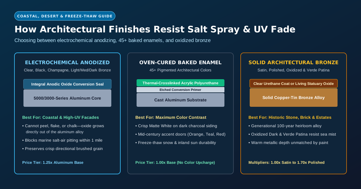
| Craftsman & Prairie Bungalow | Ribbon Deep (#2930), Goudy Extra Bold (#2916), Copperplate (#2908) | Bronze Oxidized Dark, Medium Bronze Anodized, or Verde Patina Bronze | Flush Stud or Rail |
| Spanish, Mediterranean & Colonial | Trajan Bold (#3002), Trajan Prismatic (#3042), Palatino Semi Bold (#2927) | Black Anodized, Oxidized Bronze, or Hand-Polished Bronze | Flush Concealed Stud |
| Modern Farmhouse & Loft | Clarendon Medium (#2906), Helvetica (#2918), Eurostyle Bold Ext (#2909) | Black Anodized (on white siding) or Matte White Enamel (on charcoal) | Flush or 1/4" Spacer |
Horizontal, Vertical, or Diagonal? Matching Orientation to Architectural Lines
Once you have narrowed your typeface to match the home’s architectural period, evaluate how the numerals sit relative to surrounding trim geometry. Most American eyes read horizontal left-to-right strings roughly 25% faster from a moving car than vertical stacks, making horizontal placement centered over garage lintels, entry transoms, or low garden site walls the gold standard whenever 18 to 28 inches of clear width exists.
When mounting onto narrow 6-inch porch posts or slender mid-century vertical cedar pilasters, stacking numerals top-to-bottom feels crisp and architectural—provided you avoid ultra-wide extended faces (such as Eurostyle Bold Extended or Helvetica Bold Extended) whose horizontal proportions look squat in a vertical column. Conversely, tall geometric or condensed faces like Futura, Ribbon Condensed, and Optima create a balanced vertical rhythm that draws the visitor’s eye naturally toward the front door hardware.
Ready to Price & Customize Your Own Set?
Select from 38 architectural fonts, heights from 2" to 24", 12 anodized & bronze finishes, or 45+ baked enamel colors—with full-size paper drilling templates available.